

You get paid for your value, not the time you took to bring it. This is a call to action (CTA) in a nutshell. These pack a punch in button form. When was the last time you ignored a flashing, red button, especially one that offered amazing discounts?
A CTA can differ in size and style depending on your site’s design and conversion requirements. Three common buttons are:
- Download buttons
- Free trial buttons
- Add to cart buttons
What Makes a Great Call to Action?
A high-converting CTA can make your conversion rates soar. Timeless ones have the following factors in common:
1. Strategically Positioned
A CTA should take pride of place in any online incentive you offer. Ideally, visitors should spot it as soon as they visit the page. To ensure this, position the button above the fold rather than near navigation or other elements on the page. Here is a great example:

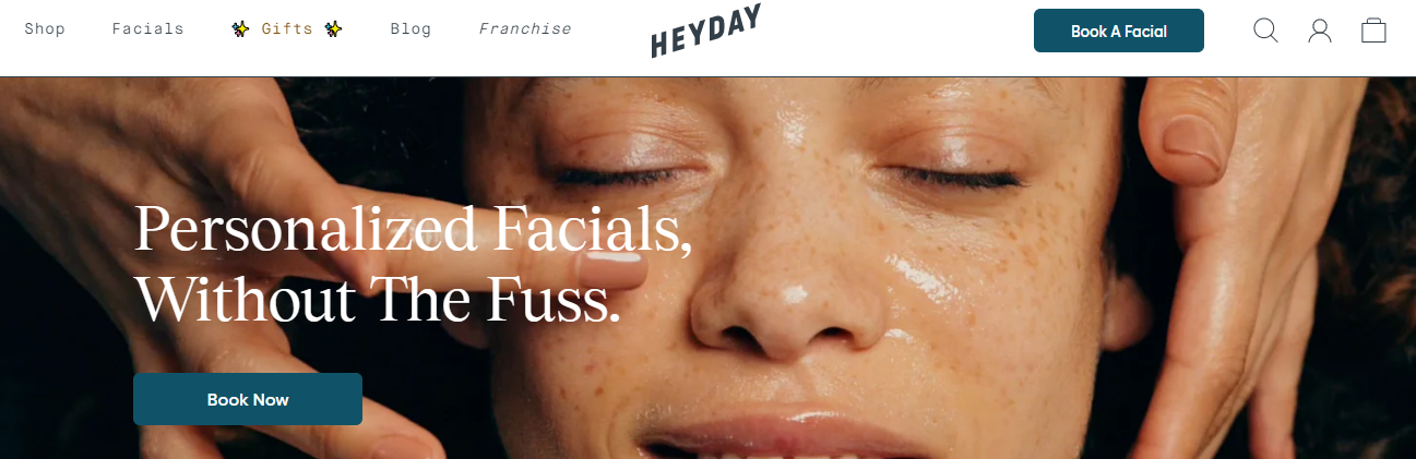
The Call to Action is clear and prominent enough right under the headline and displayed over their core offer. The headline provides context while the CTA delivers on it. Who can resist?
That doesn’t mean you should stick with just one CTA and headline. Add additional ones throughout the page to mop up visitors who didn’t click on the first one. These can be more assertive and direct enough to convince people not convinced by the initial CTA button.
2. Standout, Yet Use a Matching Color Palette
A CTA button doesn’t necessarily have to be vivid or have a flashy color to attract clicks. While it needs to stand out and attract attention, it should persuade rather than force visitors to look at it. The colors should contrast with the surroundings just enough to jump out at users and let them know where they should click. Take Zoom, for instance:

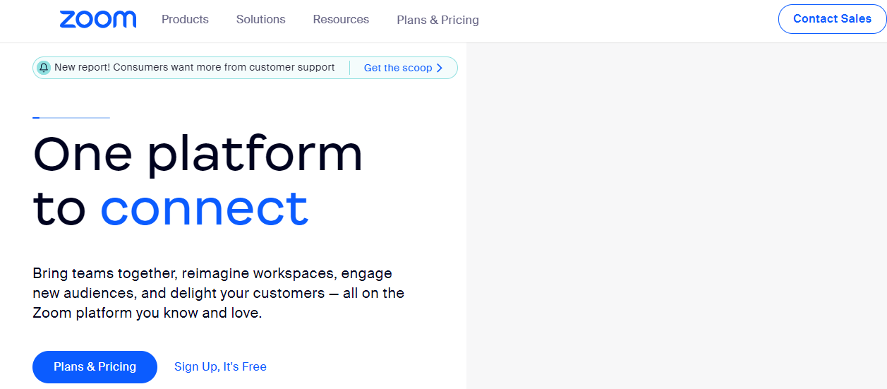
All CTA buttons are peppered across the content are either in blue font or highlighted in font in a shade that looks professional and clean. The offers stand out without being aggressive about it.
3. It Has Actionable Content
It’s in the name – an actionable CTA button has to be action-oriented. So rather than using boring terms such as ‘submit’ or ‘reserve now,’ your words should align with your offer. Here are some great examples you can steal:
- Newbies Start Here
- FREE Sign Up!
- Sign Up For Weekly Goodies!
- I’m In
- Take This Course Today!
4. It Has a Sense of Urgency
A CTA button that creates a sense of urgency can improve your click-through rates considerably. Here are some great examples you can take inspiration from:
- Last Day Left!
- Sign Up And Get 50% Off Today!
- Get The Early Bird Discount!
- See All Success Stories!
This type of content has just enough urgency to pique curiosity and compel users to click and satisfy it. Make sure the content for the button doesn’t exceed more than five words. More than that, it will become a whole sentence that can be off-putting.
The bottom line is that a clickable CTA is far from fancy. It’s short and brief enough to attract attention and entice users to click on it. More than that, and it starts to look spammy. Luckily, you can balance out these elements using a simple extension from cloudHQ.
Create a CTA Button in Email… Fast.
You increase your chances of getting click-throughs by 60% with a CTA button in your emails rather than a simple link that is a whole sentence long. You don’t need to be a design expert to create one. Just install Gmail Button by cloudHQ, and you can create one easily in less than half a minute. The button will have a URL link, a unique background, text, and a border color of your choosing, and you can also play around with the size.
This is a great tool for anyone who wishes to attract visitors to their e-commerce site, blog, YouTube channel, LinkedIn profile, pricing page, and any other page which needs more traffic. Try it out and see for yourself.
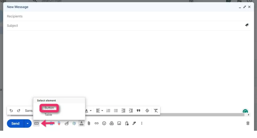
Click on ‘Compose’ in your Gmail and click on the Gmail button and then on ‘Button’:

This will open the Gmail button window where you can design your CTA button. Add text you want to display in the button and change the colors (background, text and borders) as needed.

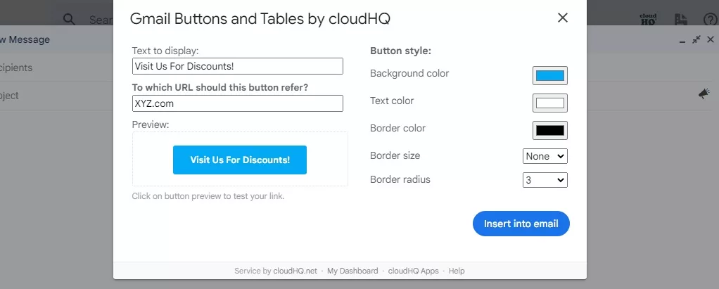
Click on ‘Insert into email’ to add the clickable button in your email. That’s it!
(See what we did there?)