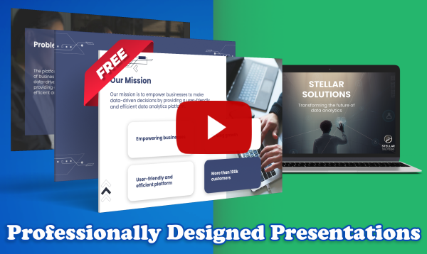
Presentations are a great way for you to communicate with a group of people. They allow you to share your message with an audience in an engaging and interactive way. Whether you are planning to educate an audience, share your personal experiences, or highlight an event, presentations are a vital tool that can be efficient and effective if used properly.
A good presentation begins with great slides. Eye-catching and attractive slides can help convey your message in a more convincing and engaging manner. On the other hand, poorly designed slides can easily distort your message, and lead to a confused audience.
3 Top Tips for Creating a Buzzworthy Presentation
The good news is that designing attractive slides does not have to be complicated. You can create your presentation using the various tools available online. Here are some tips to help you get started with designing your presentation.
1. Develop a Storyline
Building a storyline around the message you want to get across is crucial. It helps you stay focused on what you are trying to communicate and allows your audience to better understand what you are trying to get across.
For instance, if you are presenting your travel experiences to an audience, you can start your story from when you landed on the particular destination and follow through until you left. This will help your audience follow the overall theme of your presentation and will also help you stay on track with what you are saying.
The outline of the story can also be used as a tool to help organize your thoughts. Speakers can often become disorganized in their presentations because they do not know where they should start and how to present their message. Using an outline helps to alleviate that problem because it provides a guideline on what information should be delivered first and how it should be delivered. It also helps to remember the points that need to be communicated.
2. Use Visuals
It is true that a picture can say a thousand words, maybe more. A travel presentation can be made interesting, engaging, and easy to understand with strong visuals. It is hard to imagine a travel presentation without pictures and videos of the destinations. Without visuals, it would be next to impossible to get across the excitement and beauty of a place.
Having strong visuals in your presentation that are interesting and engaging will keep the audience engaged, as the people will likely spend much more time watching your presentation and will listen more attentively because they will want to see what is so interesting about a certain place.
3. Keep Text To A Minimum
You don’t want to overwhelm your audience with text; you want them to be able to focus on what you are saying. If you put everything you will say on the slide, you might as well hand them a document and sit down.
The old slides used to follow a 6 × 6 rule. This means you cannot have more than six lines on a slide and no more than six words per line. If you must put text into your presentation, it is best to follow this rule. However, modern slides only have one or two punchlines per slide, and the visuals fill in the missing information.
Use a Google Slides Theme Template
Designing presentations can be daunting for newbies and professional presenters for different reasons. Having access to the right templates can make your work easier and help make your presentation more attractive and effective.

The Google Slides Theme Templates by cloudHQ Whether you are looking to design tourism, food, product, or educational presentations, the tool can help you create a professional and polished presentation. It gives you access to some of the best templates available for free. Just select the one you want, and make a copy of it to customize and make your own.