Google has given its Chrome Web Store an entirely >new makeover in order to celebrate the browser’s 10th birthday.
The Chrome Web Store is Google’s online store for Chrome browser extensions and various web applications. It’s home to thousands of extensions that aim to make the Chrome browser more useful and productive—which very much includes our own selection of over 50 free Chrome extensions.
Just like Google’s browser update, the Chrome Web Store revamp is based on Google’s Material Theme design framework. Aimed at application developers and designers within Google’s ecosystem, this framework provides more flexibility and tools to create beautiful apps across a range of platforms.
A more minimalist look
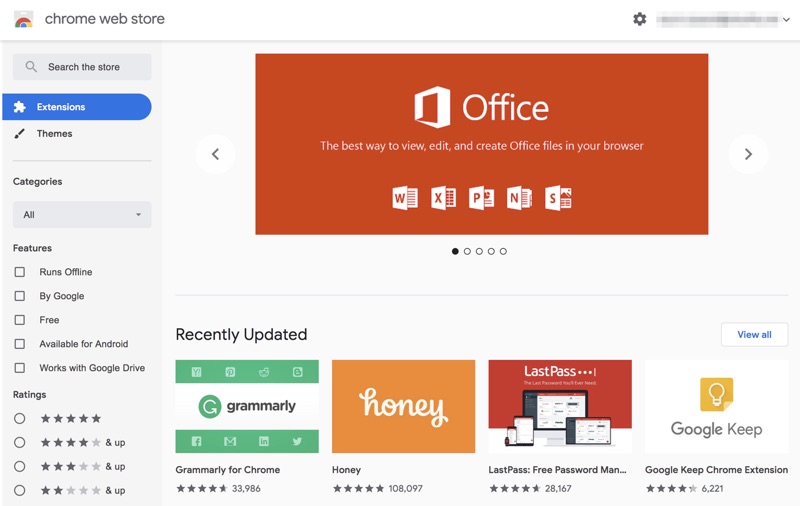
The Material Theme update for the Chrome Web Store adheres to Google’s preference for minimalist design:

Google has made a huge effort to improve aesthetics. There’s now even more white space that helps content immediately stand out. Other updates include new designs for font faces and text entry boxes, more rounded corners, and a more prominent image banner at the top highlighting featured extensions and apps.
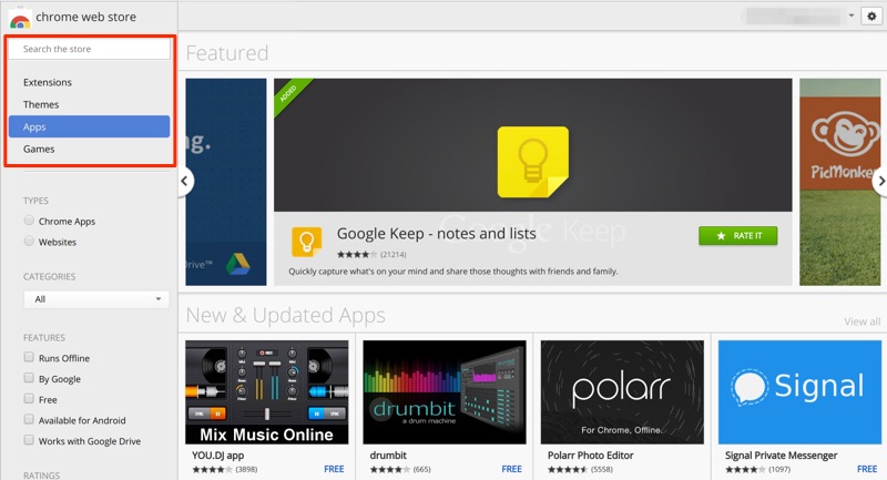
For comparison, here’s a quick look at the old Chrome Web Store interface:

A new, simplified search
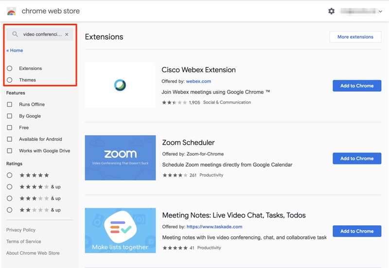
When using the new search function, the main difference you’ll note is the revamped menu on the left side panel. It actually shows fewer options than the older iteration of the Web Store.
The older version offered a choice between four kinds of tools users could search for: Extensions, Themes, Apps, and Games. But with the updated interface, in the interest of minimalism, we only see the first two options.
All of the apps and games that were available before are still accessible, but it may take a little extra time to find them via search. You’ll have to type the name of the app or game you’re looking for—or at least search a keyword or two to narrow it down.

By removing the Apps and Games options on the sidebar, it appears that Google is doubling down on the original premise of its Chrome Web Store: to help users enhance their browser experience. Themes and extensions are more relevant in this respect, than apps and games are.
The good news: Google is offering more refined categories to search from via the drop-down list on the left panel. And top-rated apps are included below the main banner image, so highly reviewed items can easily catch your eye.
Sleeker extension pages
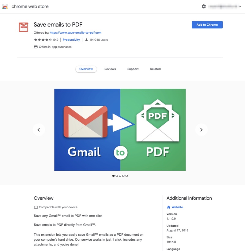
Each extension page has also gotten a new look. With the revamp, every extension gets its own page, rather than a window that pops up over the store homepage.
The individual extension pages are sleeker and more professional looking compared to the older style—in our opinion, at least. App images are now prominently displayed, and the description text has shifted lower down the page.

The actual process of downloading an extension or app is more or less the same, however. Just click on the “Add to Chrome” button that’s still located in the top right corner of the page. A small box will pop up asking you to confirm; and once you do, the extension will quickly be installed.
The new Chrome Web Store can be accessed from any browser. However, most of the extensions and themes will only run on Google Chrome and some of its variants, like the Opera and Yandex browsers.
But for those who can take advantage of Google’s offerings, there’s definitely something for everyone.